


NARRATIVE
The concept of corridor graphics throughout Ladue Horton Watkins High School's halls was part of the original schematic interior design from inception. Several benefits of this design concept included providing solutions to unify the building, solve wayfinding problems, visually break up long corridors, protect walls and reduce yearly paint maintenance. As the project progressed, over $350,000 would be invested in creating the corridor graphics and dozens of additional "Points of Pride" throughout the building. A Graphics Committee was assembled, and a 2-year process began to design and develop a Graphics Package for the school. Everyone from teachers, parents, students, alumni, donors, and staff played an integral role in one or more "Points of Pride" locations. Conceptual designs and floor plans for each item were developed along with an RFQ for Signage Company Services. Once a vendor was chosen, sub-committees were formed. The details, materials and finishes were carefully coordinated and presented to the Graphics Committee for final approval. Budgets, timelines, decision deadlines, and vendor management became central to the coordination effort.
In addition to the items shown below, the final two "Points of Pride" are still being developed. A Historic Timeline wall will be added to the East Visitor Entry, and an Athletics Mural will be located near the gym.
Size: 123,048 SF New Construction
147,079 SF Renovation
Cost: $79.2 M
FFE Product Cost: $2.2 M
Graphics Package Cost: $350,000
Completion Date: Fall 2018
Roles: Lead Interior Designer
Programming through CA
Graphics Package
FF&E Product and Finish Selections

Located in lobby of main student entry, the custom, large poured terrazzo seal exemplifies the school's long standing tradition and school pride. Custom acoustical panel design and wood feature wall compliments it's position in the space.

Conceptural rendering showing custom color poured terrazzo flooring.

Reuse of an existing bronze seal, salvaged from the demolished floor and hung behind the school's new reception desk pays homage to the old building while the addition of school's name in modern silver dimensional letters compliment the modern, new design.

Conceptual image illustrating location and scale of dedication sculpture for Dr. Donna Jahnke. It's location in the South Student Plaza seamed most appropriate, paying tribute to Dr. Jahnke's devotion, compassion, and service to all students.

Conceptual rendering of the dedication sculpture, honoring their beloved superintendent, who retired shortly after the project's completion. The sculpture boasts the work of an artist, skilled in stainless steel metalworking and a three sided granite stone column with Dr. Jahnke's favorite quote.

Detail of the text inscription on the dedication sculpture.

Conceptual image. Located in a central area of the renovated building, low ceiling heights limited the design of the Ram Shack's entry. Making use of a recessed soffit, existing columns, and the display window, the carefully planned graphic served as way-finding at the store's entrance.

The design of the school's retail store's entrance, ties into the color blocking pattern used throughout the corridors and makes good use of the existing conditions that surround it.

As part of the curriculum, students assist in running the school's retail store. Shown here, is a built-in display merchandising window, trimmed in Ladue Blue color blocking to coordinate seamlessly into the building's design.

Inside the Ram Shack, an corner wrapped wall graphic highlights the check out area where students can purchase school branded items.

Conceptual rendering.

Rendering showing "U" photo montage of LADUE Letters.

This magnetic photo montage rests on 6' tall dimensional aluminum letters and depicts current and past students. It infuses their multipurpose / cafeteria area with school pride. While the aluminum letters are permanent, the magnets are easily replaced, to allow for photo updates over time.

Concept rendering
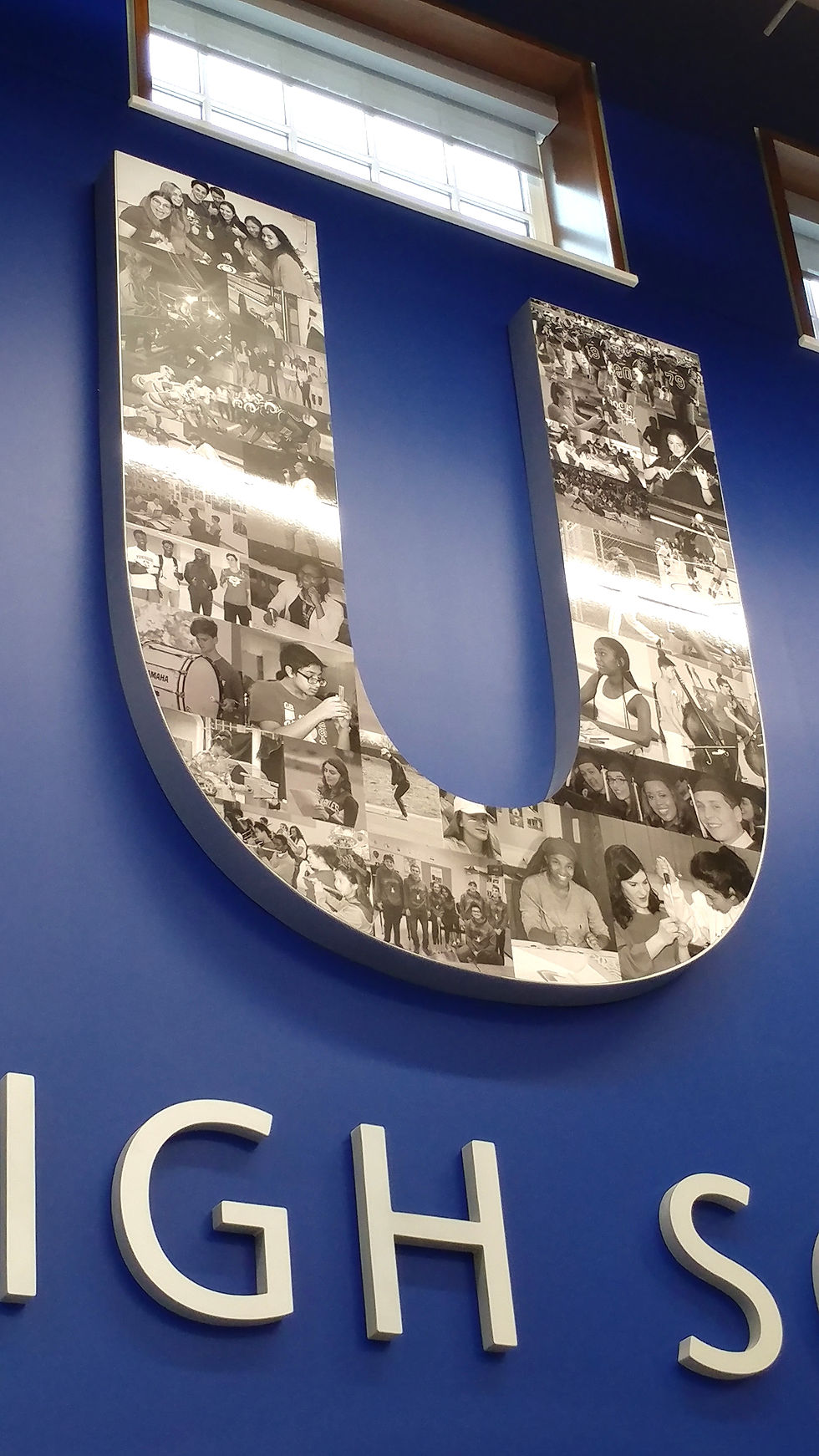
Installation photo showing "U" photo montage of LADUE Letters.

Color coded, digitally printed vinyl graphics were utilized in all corridors to solve campus way-finding concerns. The color blocking design was fully integrated into the block design of the floor patterning and all (otherwise) neutral finishes. The graphics also served to reduce paint maintenance, are easily changed, and were part of the initial interior schematic design.

Over 40 custom graphics were designed, located and coordinated into the interior design of the building. Teachers within each department selected quotes from highly regarded contributors in their field. Careful consideration was made to ensure consistent formatting, scale and design intent was maintained. Key words in the quote pop an accent "Ladue Blue" color, while dashed department names match the adjacent color blocking design.

Conceptual rendering of a typical corridor. Block design on floor was intended to break up the extremely long corridors. Accent colors, chosen from a historical palette, provide way-finding while historical quotes serve as inspirational messages to young students. Click the link to view the entire graphics package concept images sent out during the RFQ and RFP process. Materials and details were defined after a vendor was chosen, but many concepts remained consistent through process.

Concept image

LHWHS requested an updated display for class photos. Located adjacent to the main visitor entry, this design coordinates with the standard laminate and "Ladue Blue" used throughout the school. It also allows for easy additions for future growth.
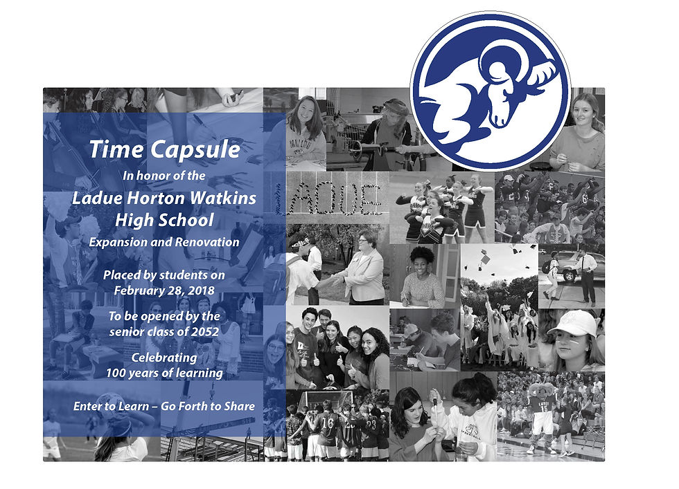
Collaboration with the 2019 senior students and the communications department resulted in this photo collage and sign, designating the interior location of the time capsule buried in the exterior wall of the west addition.

Long traditions hold firm with a plaque designating the school's Board of Educators involved in making the $85 mil renovation and addition project come to fruition. Silver text on a charcoal grey background was selected to coordinate with the building's finishes. The plaque is located in the South Student Entry.

The long standing honor of Dad's Club Students deserve a place of prominent display. Located adjacent to the main visitor entry, this design coordinates with the standard laminate and "Ladue Blue" used throughout the school. It also allows for easy additions for future growth.

Installation Photo

Click on the link for a sampling of rendered corridor elevations, illustrating all six historical colors used in the wall graphics. The renderings also show a variety of the department quotes.

Graphics plans were sent as part of the bid package and updated throughout the process. Click the link for floor plans showing locations of all graphics package items, department quotes, and other details.

Coordination with the graphics package vendor was essential to ensuring a successful project. Click the link for the approved shop drawings.


A proud display of the school's history will complete the Graphics Package. The wall will contain memorabilia and images and tell the story of their school history. Installation scheduled for Fall 2019.

The timeline will wrap two walls near the main visitor's entry. The school has been collecting items and images over the course of 2 years and is now in the process of narrowing down selections and data points for the display.